The Quarry at Groveland
DELIVERABLES:Brand Identity
INDUSTRY:Multifamily Real Estate
YEAR COMPLETED:2025
The Challenge
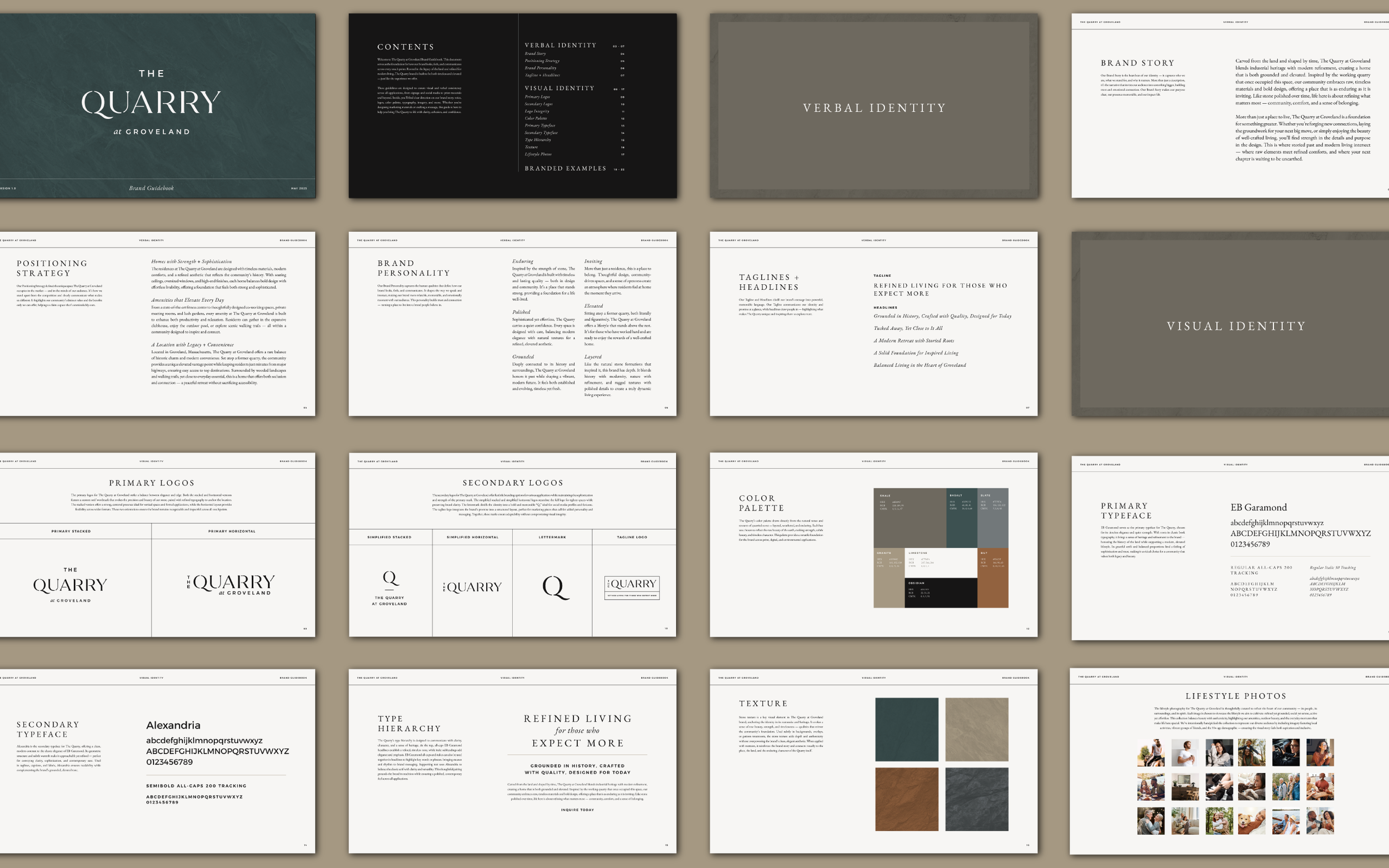
The Quarry at Groveland needed an identity that honored its quarry heritage while appealing to modern professionals and discerning residents. The brand had to feel established and aspirational while balancing rugged natural roots with refined sophistication.
The Solution
The identity draws on stone textures, a neutral yet rich palette, and a type system that blends classic and contemporary styles. A versatile logo suite — from architectural wordmarks to a bold “Q” monogram — creates cohesion across print, digital, and environmental applications, striking a balance between strength and elegance.
The Result
The resulting brand feels timeless, tactile, and elevated, setting The Quarry apart as a premier residential destination while remaining deeply tied to its landscape and heritage.