TwentyOne01 on Market
DELIVERABLES:Logo Design
INDUSTRY:Multifamily Real Estate
YEAR COMPLETED:2025
The Challenge
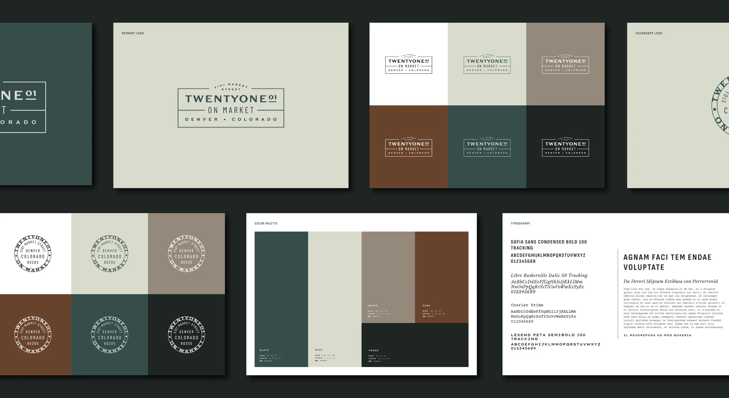
TwentyOne01 on Market needed a brand identity that balanced its historic roots with Denver’s fast-evolving downtown lifestyle. The branding had to avoid dated aesthetics, appeal to both younger and more established residents, and convey urban energy without sacrificing sophistication.
The Solution
I developed a timeless, modern identity built around a neutral, natural color palette and a clean, energetic logo system. Instead of leaning heavily on the building’s Piggly Wiggly history, we prioritized approachable sophistication and authentic urban character that would resonate across generations.
The Result
The refreshed identity positions TwentyOne01 as a stylish, enduring home base for city dwellers — equally attractive to vibrant twenty- and thirty-somethings as well as refined residents in the historic structure — strengthening its place in Denver’s contemporary downtown scene.

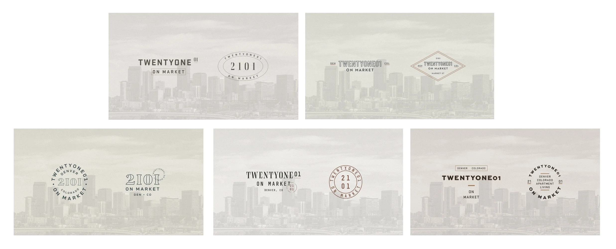
Unused logo concepts