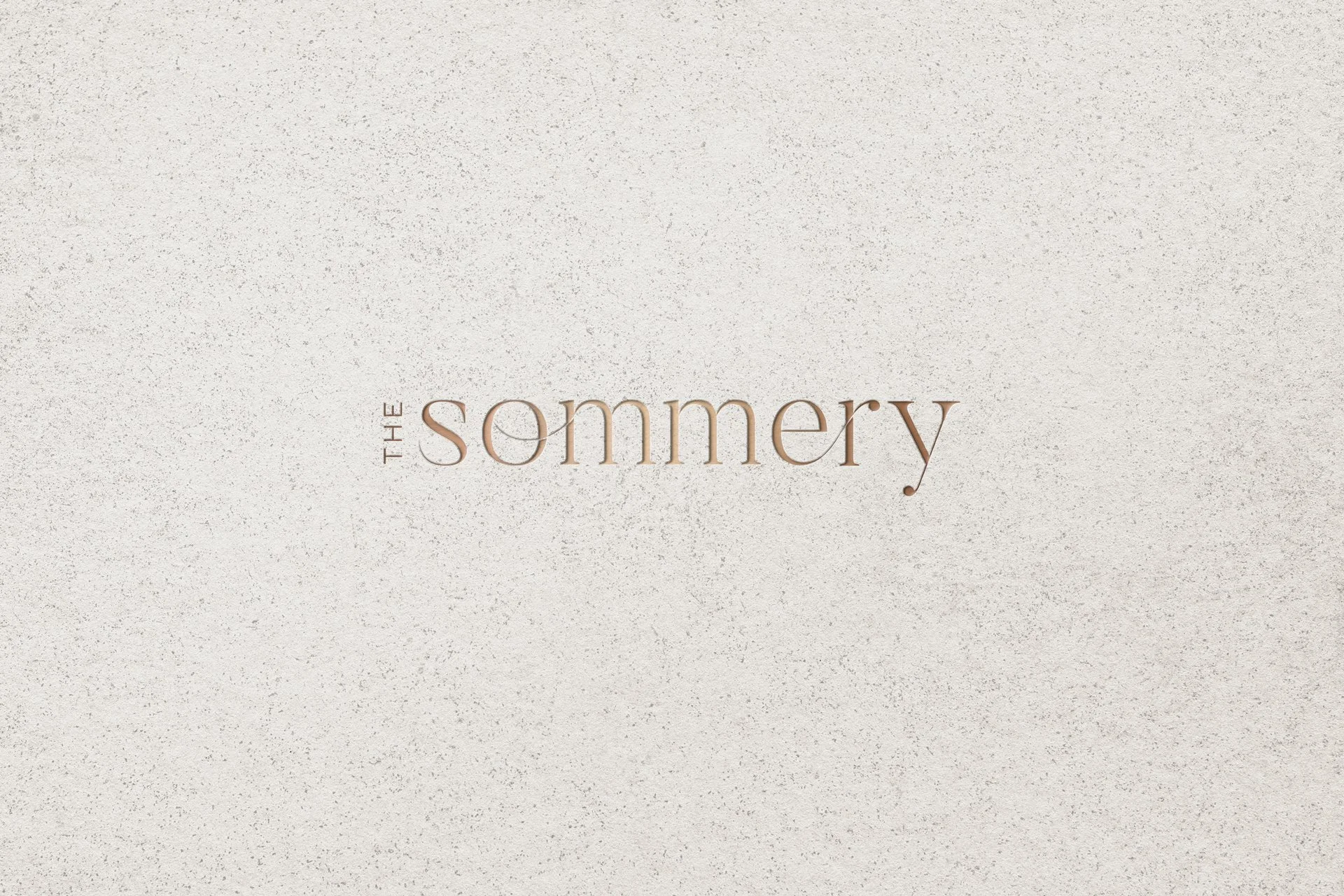
The Sommery
DELIVERABLES:Visual identity, collateral design
INDUSTRY:Multifamily real estate
YEAR COMPLETED:2021
The Challenge
The Sommery, a new apartment community in Round Rock, Texas, needed a visual identity that balanced European elegance with contemporary Texas vibrancy. The brand had to feel sophisticated yet approachable for modern residents.
The Solution
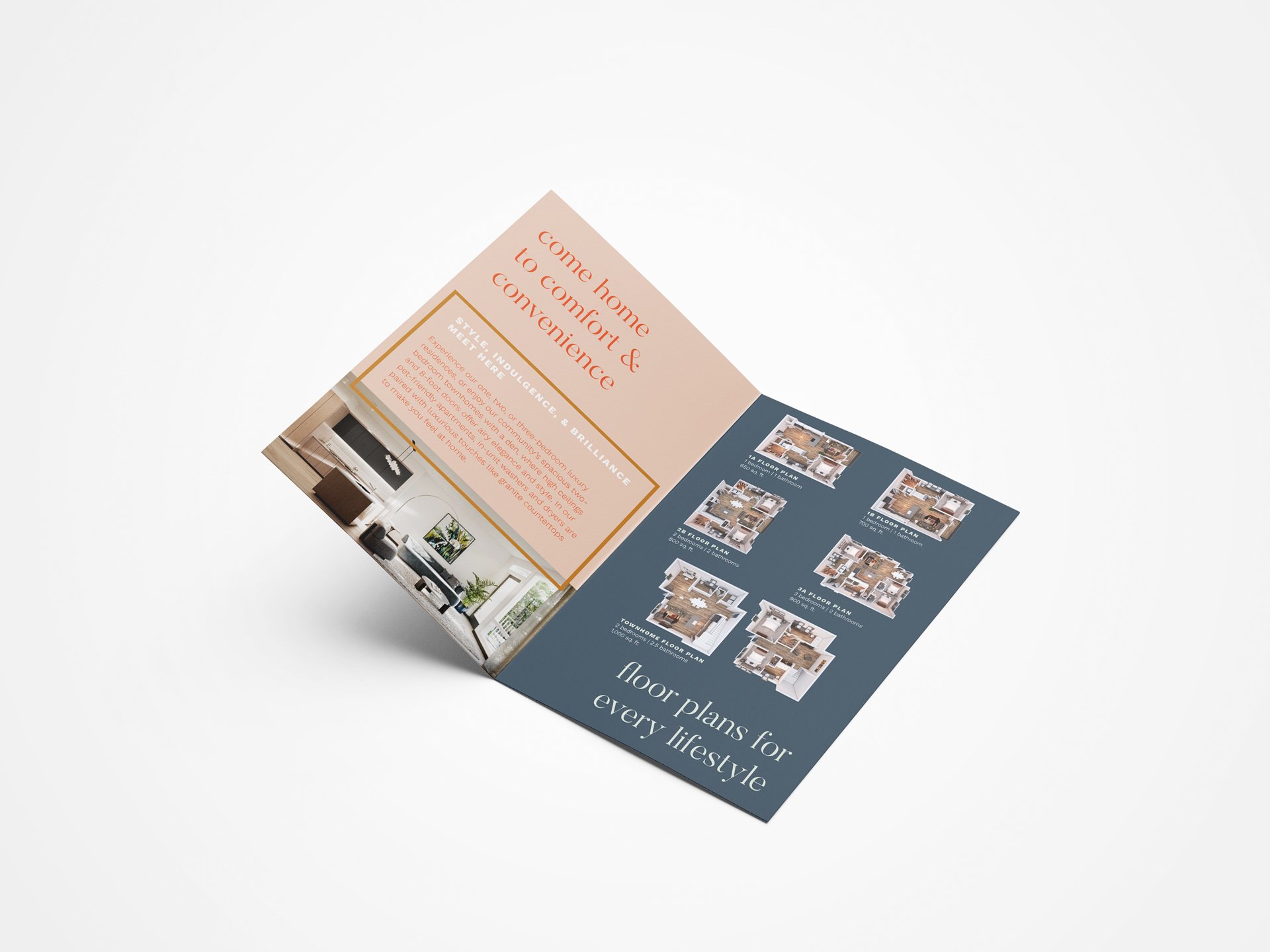
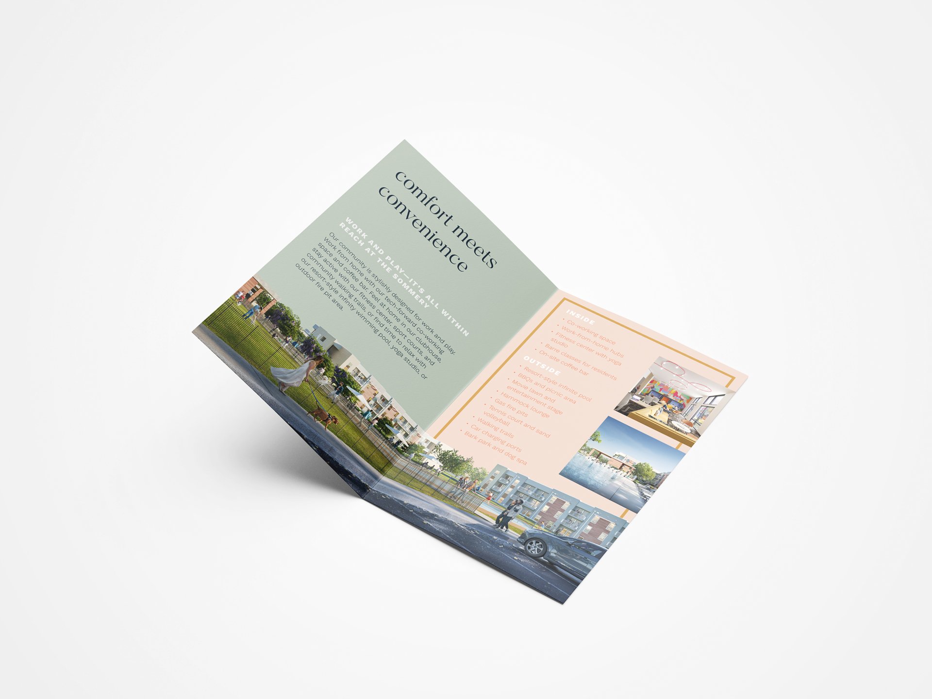
The identity features an elegant, feminine logo inspired by the community’s name, paired with visual elements that merge timeless European design with energetic, modern Texan aesthetics. Collateral materials and the website carry this refined yet lively language throughout.
The Result
The brand positions The Sommery as a sophisticated and vibrant community. Its visual identity harmonizes elegance with contemporary energy, inviting residents into a space that feels both luxurious and approachable.