Taylor Swift Album Redesign Project
Speak Now (Taylor’s Version)
This personal project series explores how I would rebrand and redesign Taylor Swift’s albums, including the album covers and lyric booklets. While it’s a fun way to express my love for Taylor Swift’s music, it’s also a design challenge — an opportunity to solve visual problems by reimagining how the artwork and content are arranged. Each redesign aims to reflect my interpretation of the album’s core themes while honoring the original branding and the spirit of the era it represents.
Speak Now holds a special place in my heart — not only was it the era when I first fell in love with Taylor Swift, but it was also the tour where I saw her live for the first and only time. The songs and themes on this album are some of my all-time favorites, steeped in nostalgia. I’ve always seen it as a more mature, shadowed sister to Fearless — a little older, a little wiser, and far more unfiltered. It’s an album of bold expression, driven by the idea of speaking your truth, whether in life’s defining moments or the quiet ones we carry long after they’ve passed.
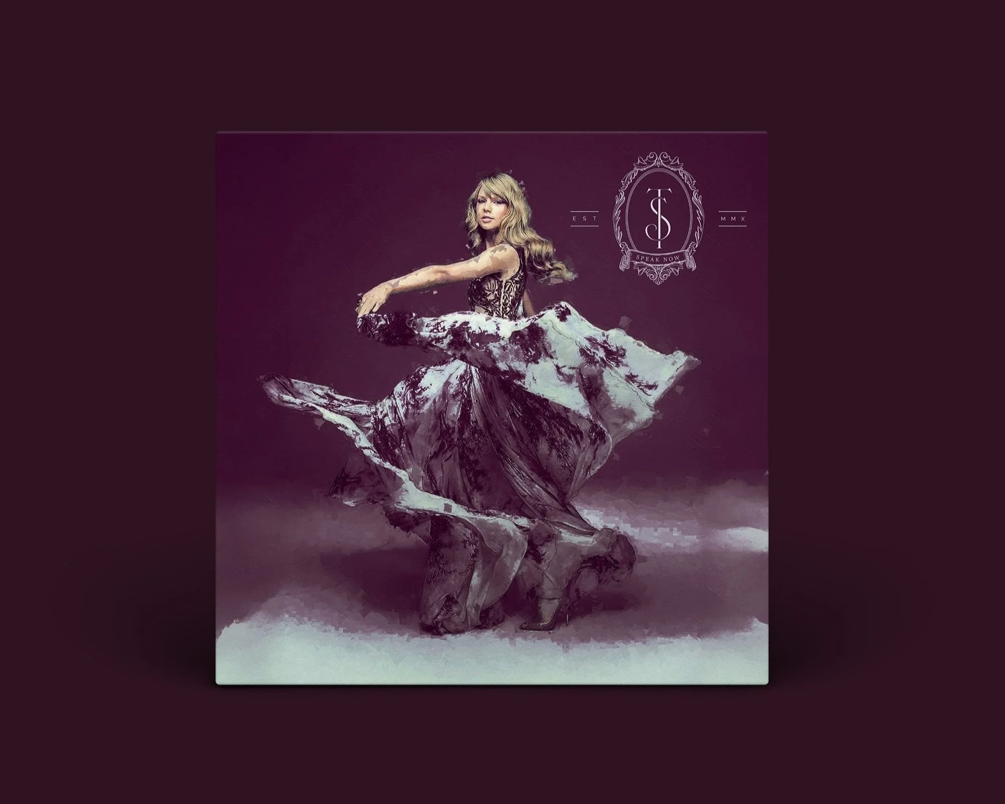
Sonically, Speak Now leans heavier — more electric guitar, drums, and sweeping orchestral strings. It reflects a shift toward greater self-possession and control. Visually, it has always felt unmistakably purple: regal, elegant, and mature, yet still whimsical and vibrant. When I think of this album, I see splashes of paint, ornate antique frames, deep palettes of plum, rust, emerald, and gold, balanced by soft pinks and lavenders. There’s an energy to Speak Now that’s uniquely weathered and rustic, yet loud, bright, and unafraid.
My redesigned covers for Speak Now (Taylor’s Version) capture that sweeping, theatrical spirit with a bold, painterly elegance. The deep plum backdrop and regal framing — like the ornate monogram crest — give it a sense of legacy and grandeur. Elegant serif typography and brush-painted textures heighten the contrast between youthful emotion and mature creative direction.
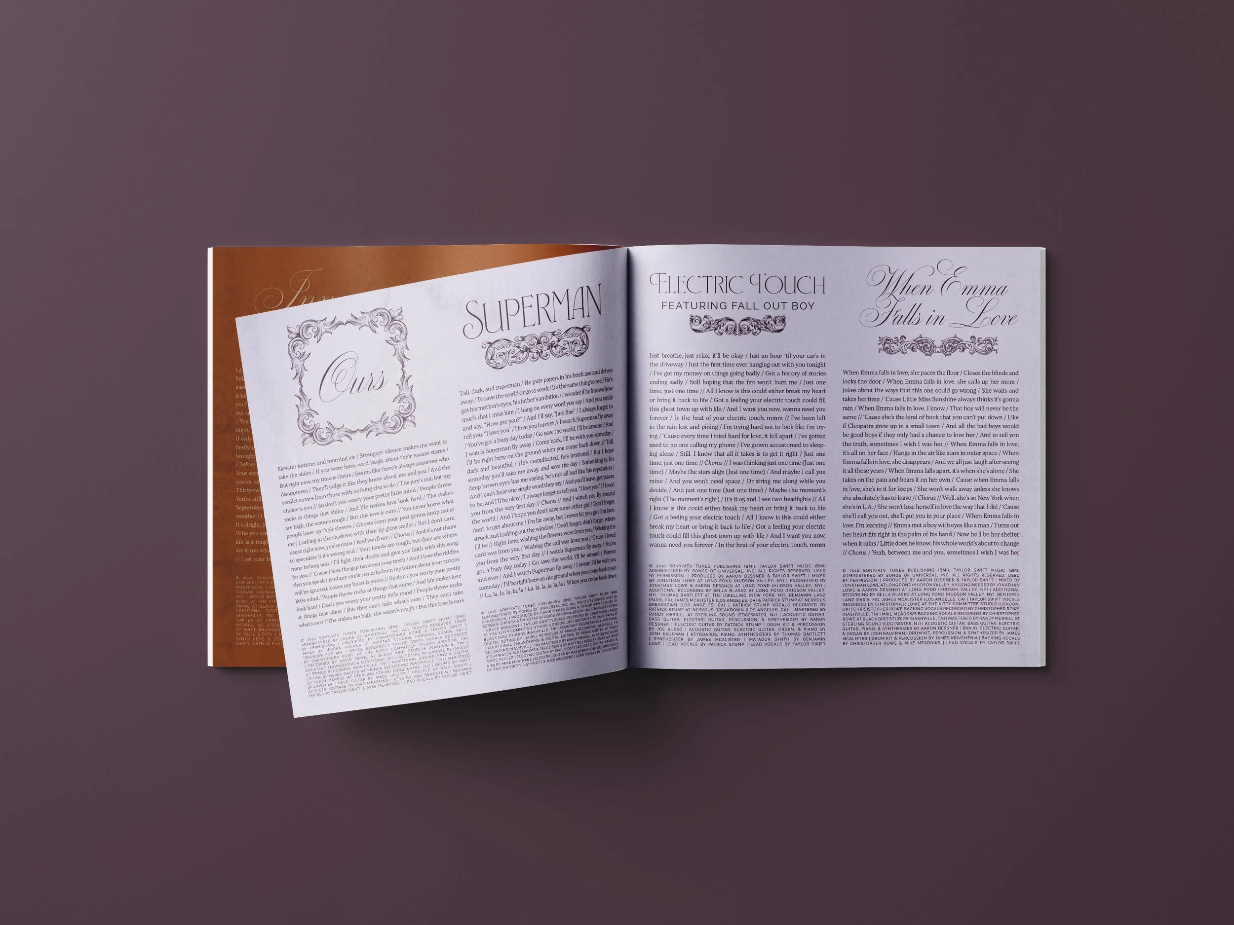
The accompanying lyric booklet mirrors this tone — lush and theatrical. Each page feels like a stage, filled with lavish tones, romantic textures, and expressive brushstrokes. The design flirts with fantasy and baroque elegance with typography that blends classic serif structure with script romanticism, perfectly reflecting the dual identity of the record.
This redesign reinterprets Speak Now as a work of dramatic self-expression — a blend of fairytale imagery and emotional realism. It emphasizes both the magic and the melancholy of growing up, falling in love, and learning to speak your truth.