Pratum Companies
DELIVERABLES:Naming, Brand Identity, Collateral Design
INDUSTRY:Real Estate
YEAR COMPLETED:2024
The Challenge
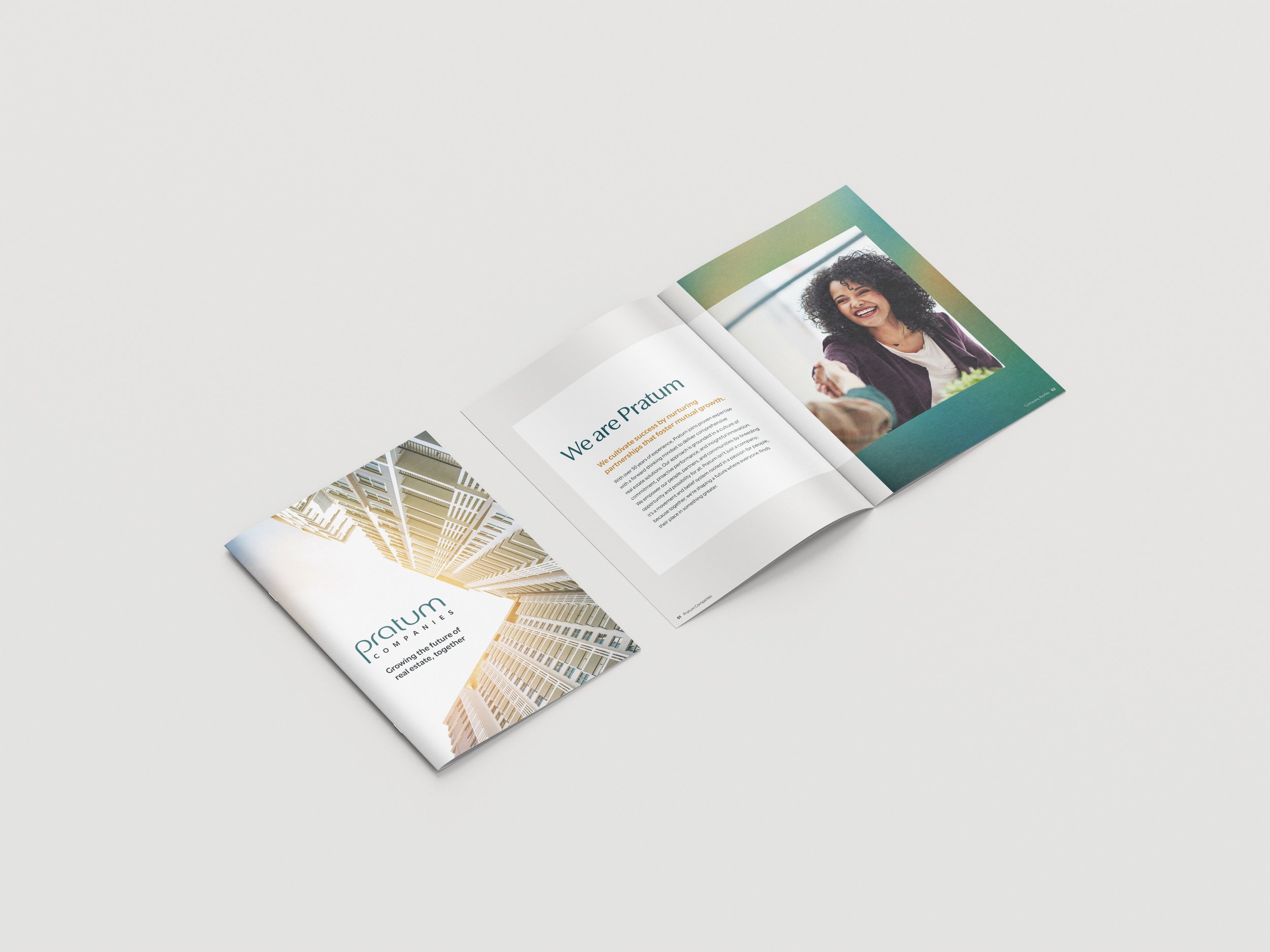
Pratum Companies formed from the merger of three real estate brands in Washington D.C., and needed a unified name, brand identity, and collateral system. The goal was to create a cohesive identity that reflected growth, openness, and the company’s new integrated mission.
The Solution
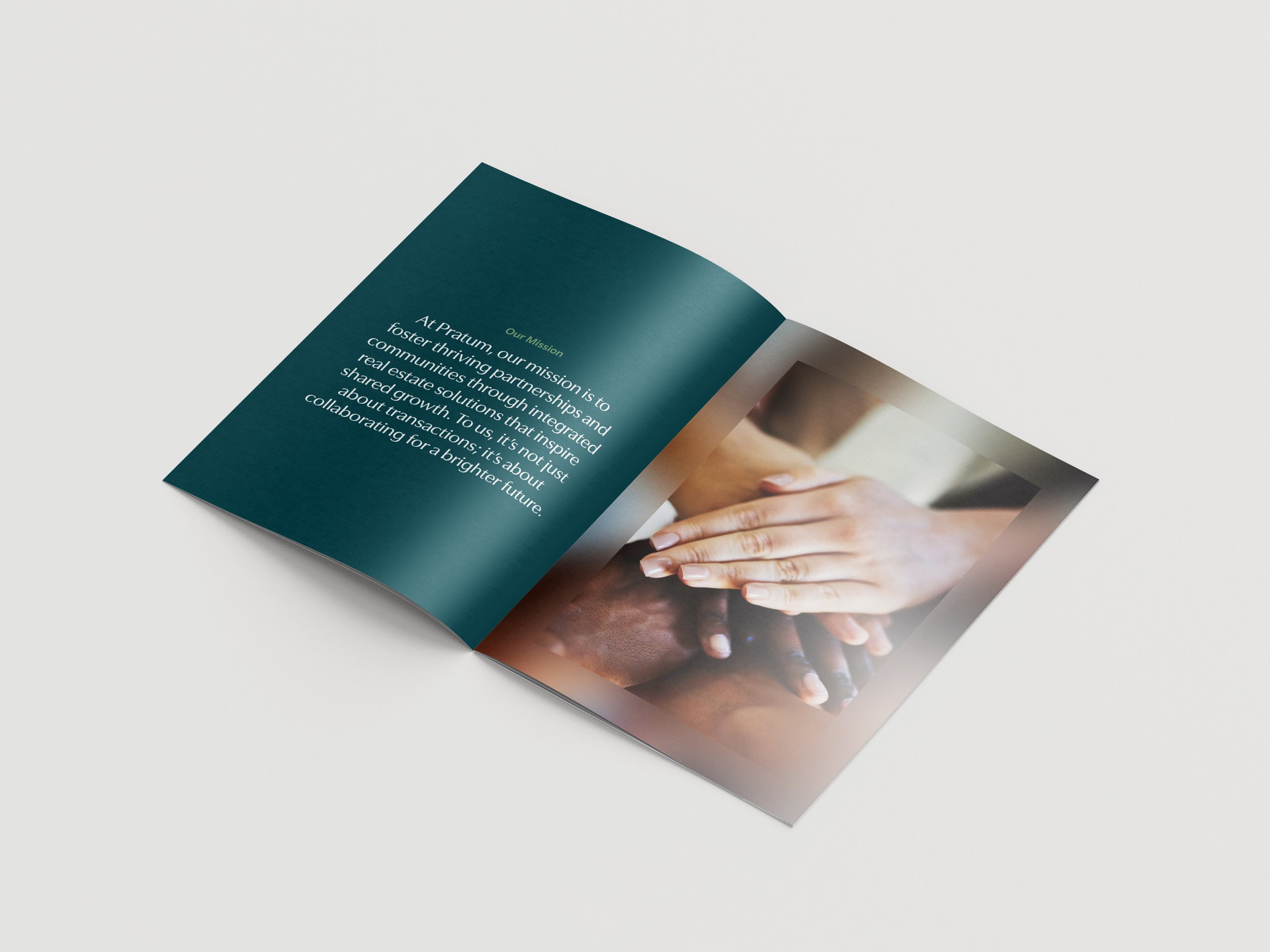
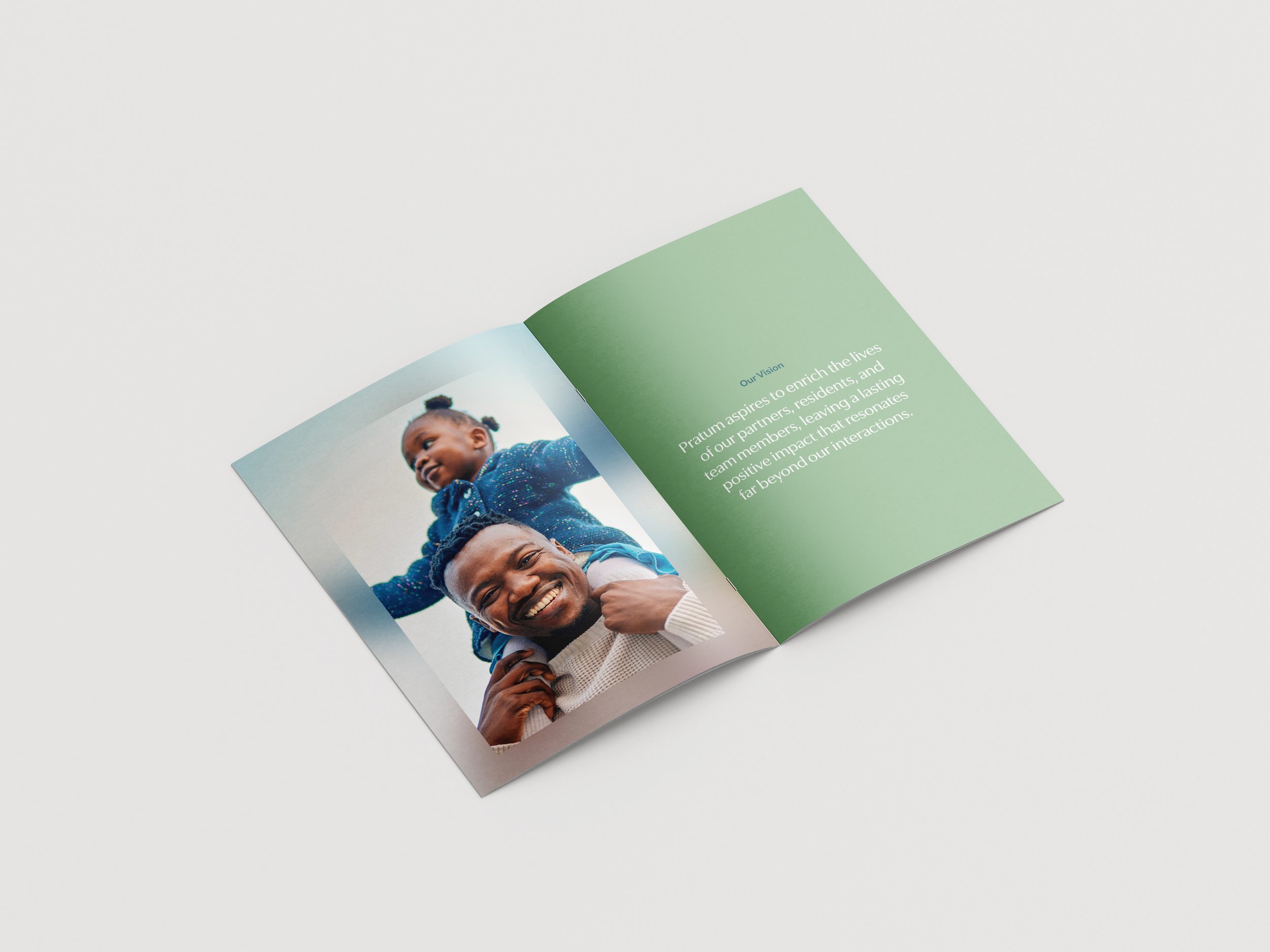
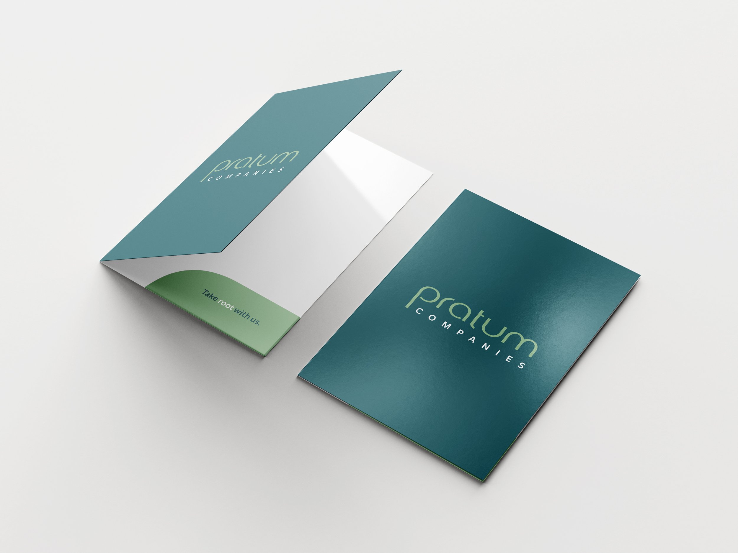
The name Pratum, meaning meadow or field in Latin, inspired a visual identity rooted in growth and possibilities. The design features a modern, clean wordmark with a stylized “P” emblem, a fresh color palette inspired by open fields, and a balanced system of colorblocking and thin lines to convey simplicity and sophistication.
The Result
The brand successfully communicates Pratum Companies as a unified, modern, and forward-thinking real estate company. Its clean and versatile identity reflects growth, openness, and a sense of possibility, giving the newly merged organization a strong, cohesive presence.


Unused Logo Concepts