Pointe San Marcos
DELIVERABLES:Brand Identity
INDUSTRY:Multifamily Real Estate
YEAR COMPLETED:2025
The brand refresh for Pointe San Marcos aimed position the property as the premier choice for Texas State University students by blending youthful sophistication with the warmth of a tight-knit community. Through a design ethos that is fresh, light-hearted, and locally inspired, the new branding elevates the property’s identity to embody modern Class A standards, balancing vibrant student life with a refined aesthetic.
By incorporating subtle nods to San Marcos’ unique culture, such as its proximity to the river and the spirit of TXST, and emphasizing key differentiators like exceptional customer service, diverse floor plans, and an unbeatable location, the brand refresh creates a distinct and memorable identity that appeals directly to college students seeking a deluxe living experience close to campus.
DESIGN NOTES:
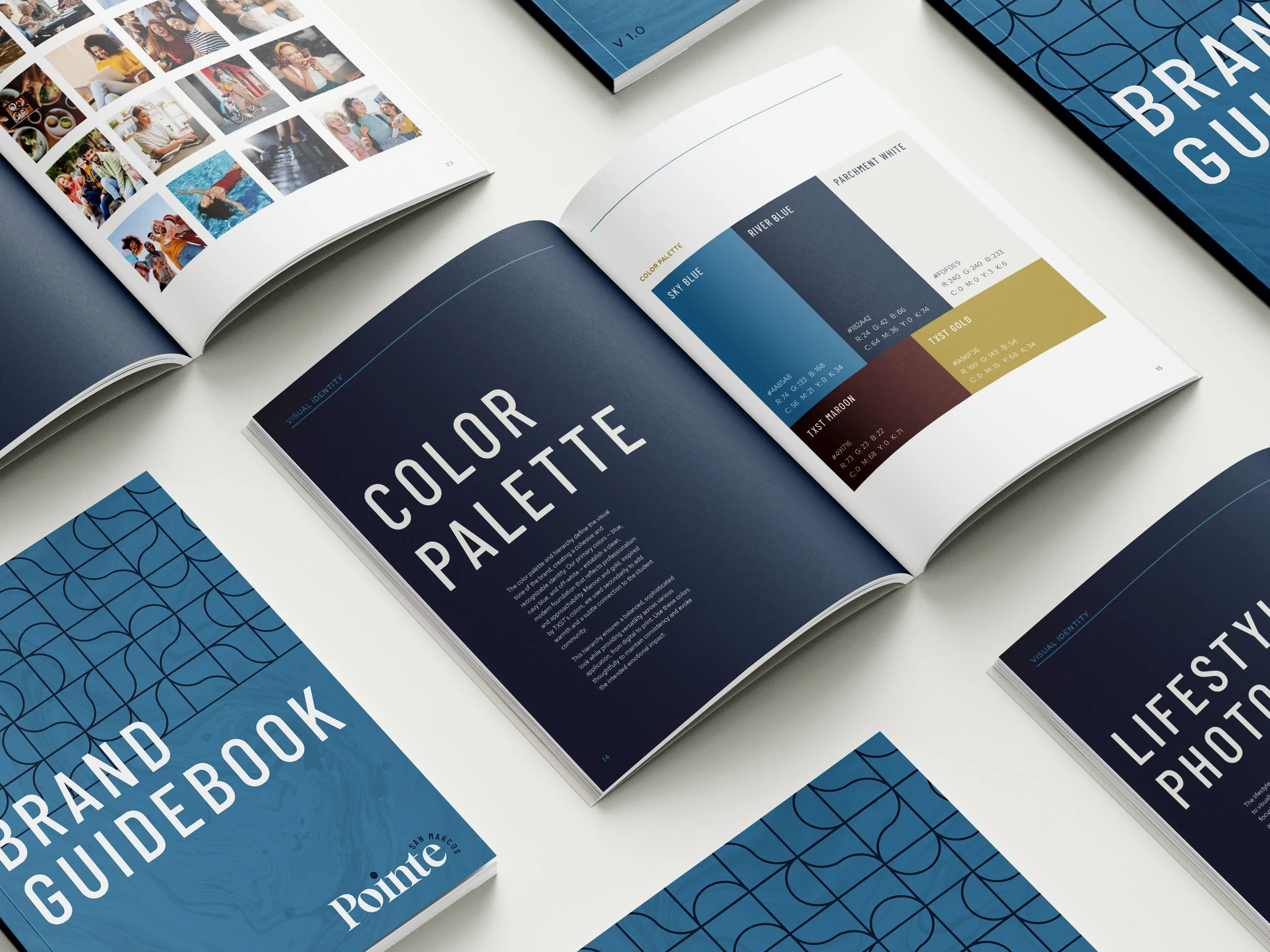
Emphasizing blue tones and neutrals, we retained the original navy from the previous Pointe branding. The maroon and gold remain as subtle nods to TXST, used as secondary accents. This updated palette feels more sophisticated and rich, reflecting both the San Marcos river and the college connection.
The texture collection features a soft, marbled liquid style, referencing the San Marcos River and adding a fresh, organic contrast to the brand's structured identity. Additionally, a geometric, art-deco-inspired pattern reinforces the river motif through clean, flowing linework. Both the patterns and textures can be used together or as standalone elements, providing versatility and balance to the brand.
The logo suite incorporates curved stylizations that complement the river motif. Overall, the updated suite achieves greater cohesion and tells a clearer, more unified story through the repetition of key elements.